


-
Branding
Monterrey, MX
-
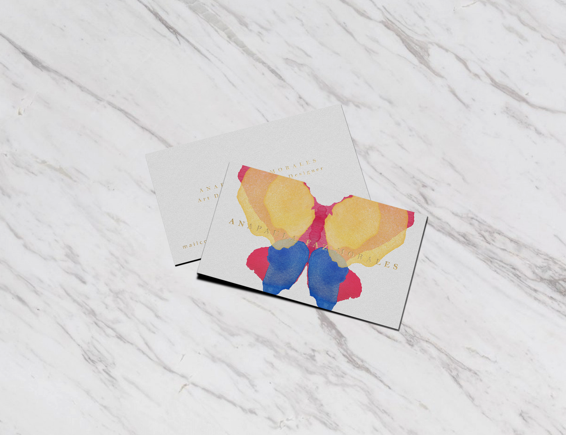
The meaning behind a butterfly is what originated the concept for Ana Paula Faz’s psychotherapy practice. The butterfly in many cultures is the symbol for transformation, change and happiness. Given the fact that the whole purpose of psychotherapy is to improve the well-being and mental health of the patients, we thought the butterfly would be a perfect fit.
For the color palette we used as reference several brain scans that are considered healthy and happy. The structure and form of the logo was also based on the same brain scans.
The typography used gives formality to Ana Paula’s practice and was considered a good contrast to the more organic and colorful logotype, designed using watercolors to achieve a more emotional and expressive image.